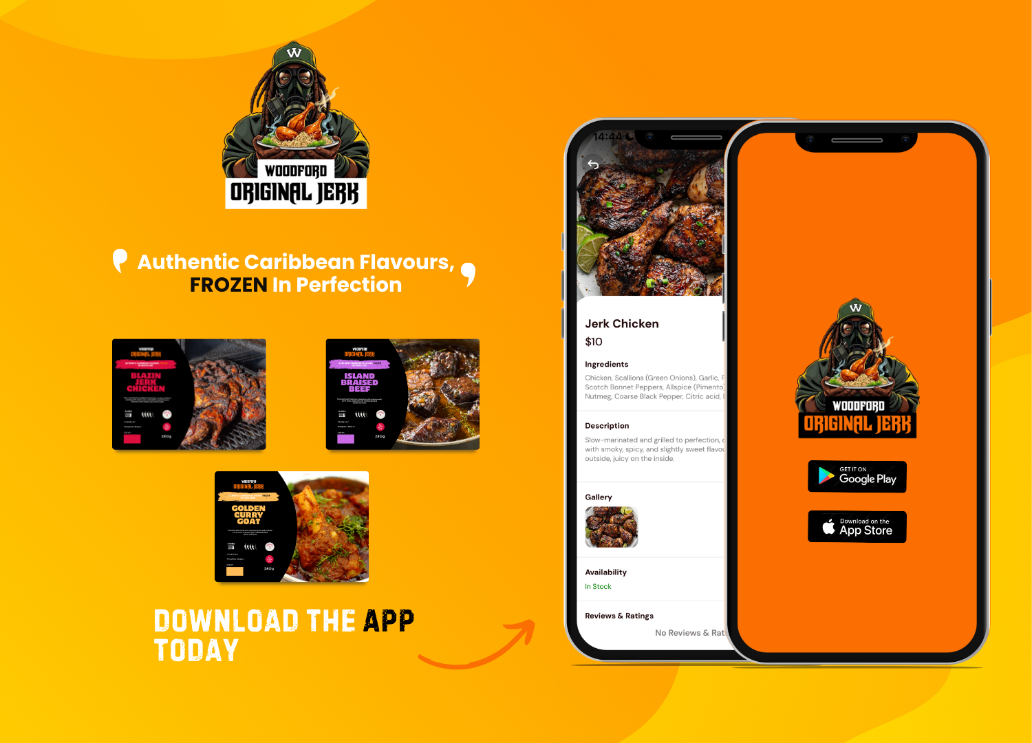

Design Brief for Woodford Original Jerk
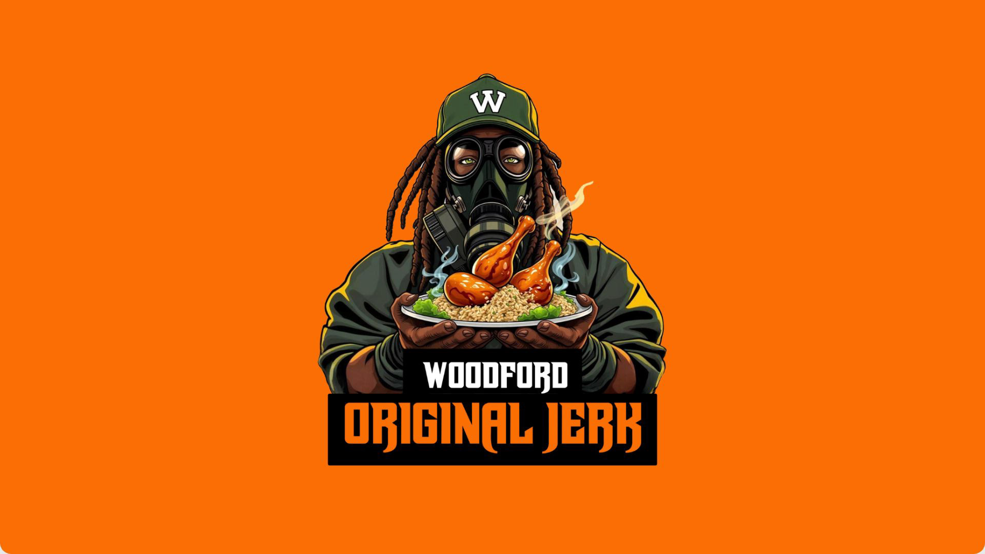
The Woodford Original Jerk logo refresh balances tradition with a bold, modern update. The refined mascot now carries a tray of food instead of kitchen tools, reinforcing the brand’s essence—delicious, authentic jerk culture. The bold streamlined font enhances readability, ensuring strong brand presence across signage, social media, and packaging, making it instantly recognisable to both loyal customers and newcomers.
Reason for Design and Colours
The design captures the warmth, energy, and vibrancy of Caribbean flavours. The rich, earthy tones echo the deep spices of jerk seasoning, while brighter accents evoke the lively atmosphere of communal dining. The updated typography adds a clean, confident feel, ensuring the brand stands out in digital and physical spaces while maintaining its approachable, food-focused identity.
This refresh keeps Woodford Original Jerk visually dynamic and culturally rooted—ready to connect with a broader audience without losing its authenticity.


The brief was to deliver a rebranding kit and growth strategy for the client. This included designing a logo, app landing page, branding material (flyers, banners, templates, menus) and promotional assets. To scale the business, I implemented a cross-channel marketing strategy utilising targeted promotions to expanded customer reach and open up new revenue streams.
✔ Marketing strategy
✔ Social media content
✔ Graphic design
✔ Photography and videography
✔ AI prompts